Mercearia Long Fong -
Packaging Illustration
龍鳳餅家 - 包裝插畫設計
Client|Mercearia Long Fong
AD|WWAVE DESIGN
Photo|WWAVE DESIGN
Illustration only
2021
AD|WWAVE DESIGN
Photo|WWAVE DESIGN
Illustration only
2021


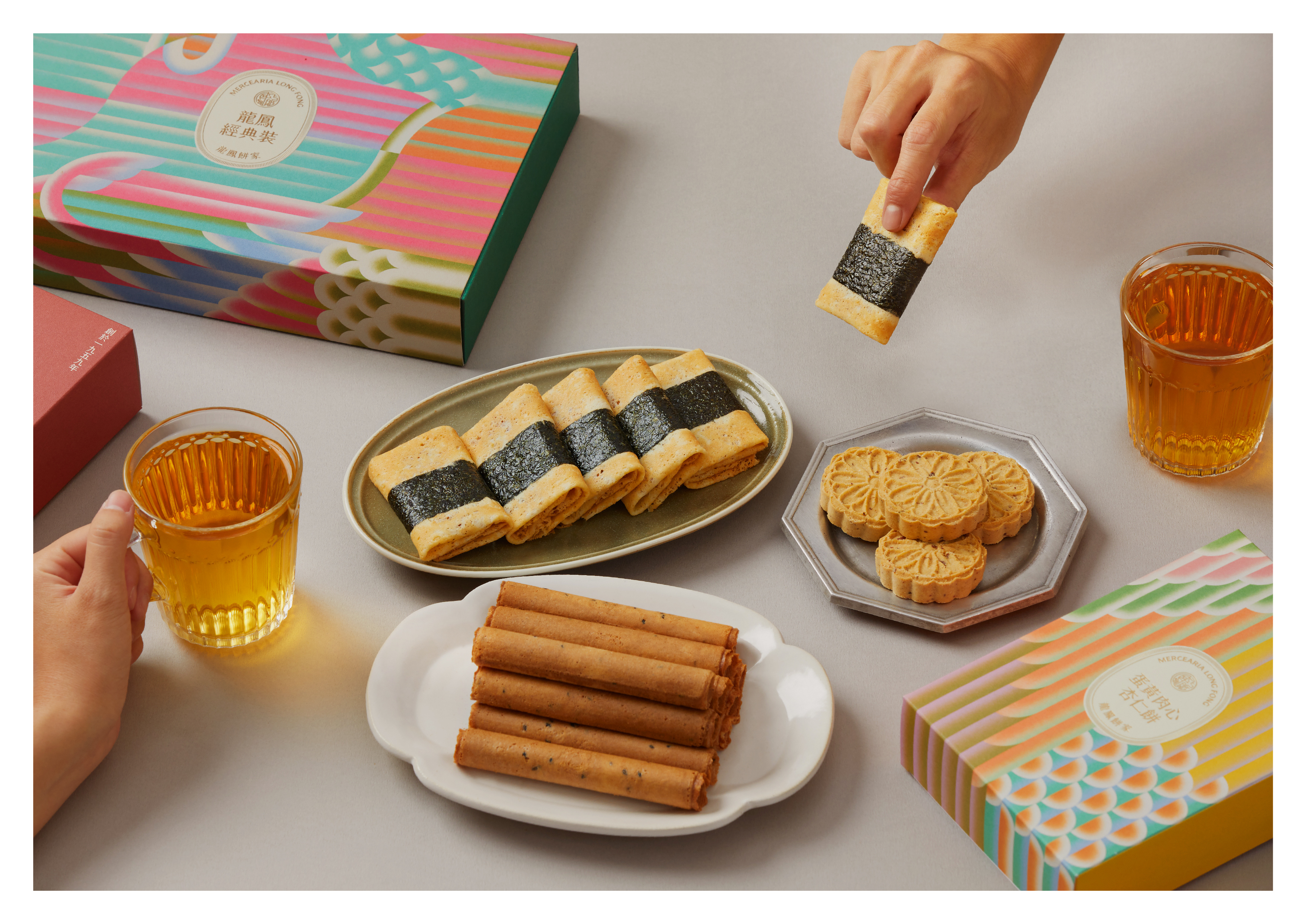
This project was part of a rebranding for Mercearia Long Fong, a traditional biscuit boutique based in Macao, led by WWAVE DESIGN. I was invited to create the main visual illustration for the new packaging system.
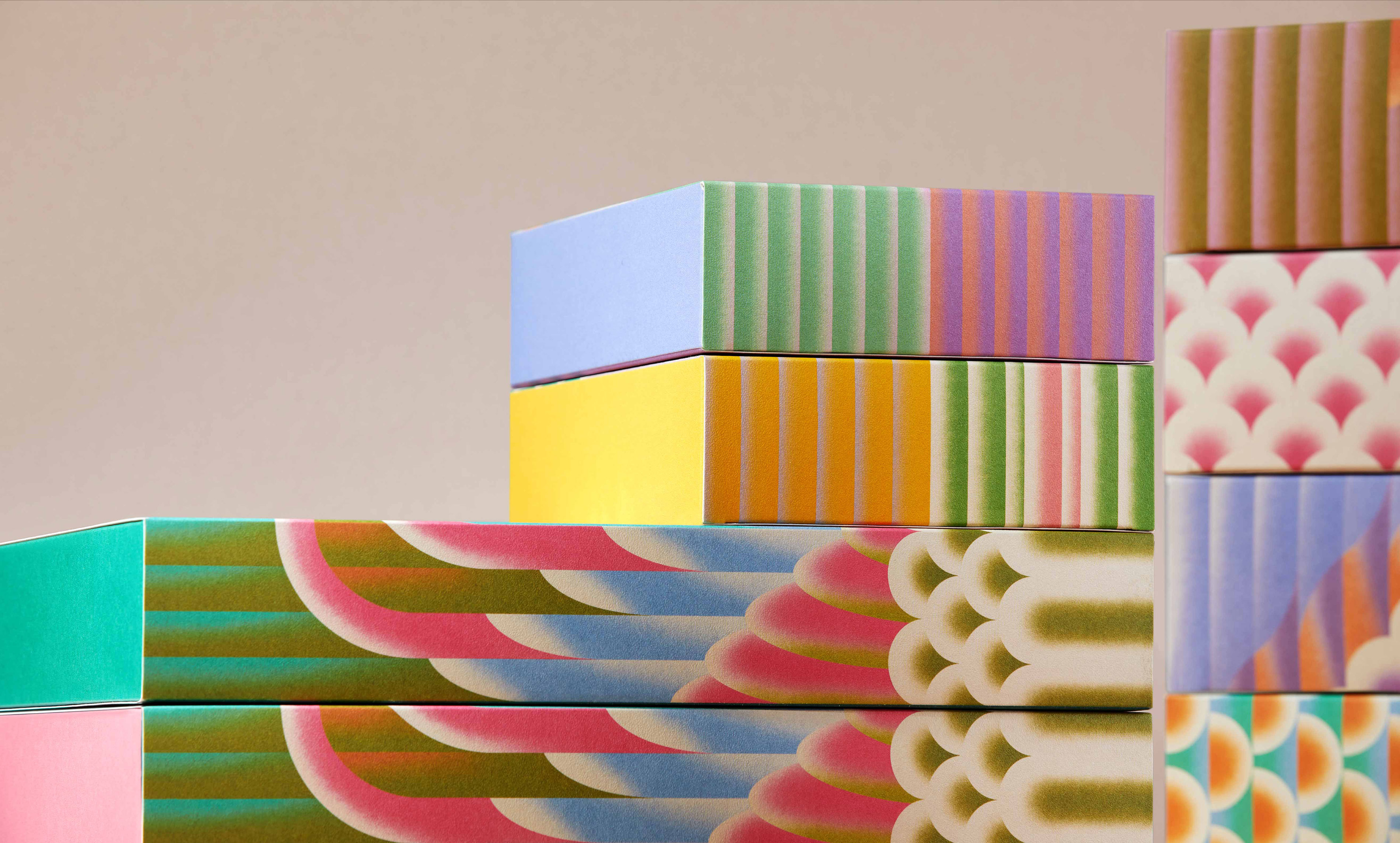
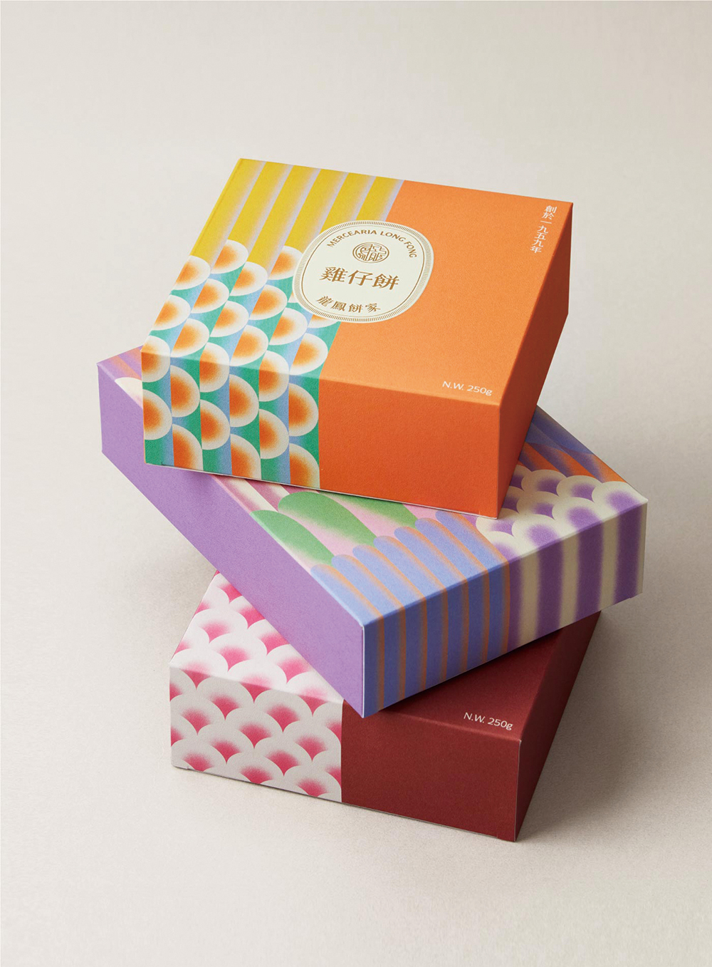
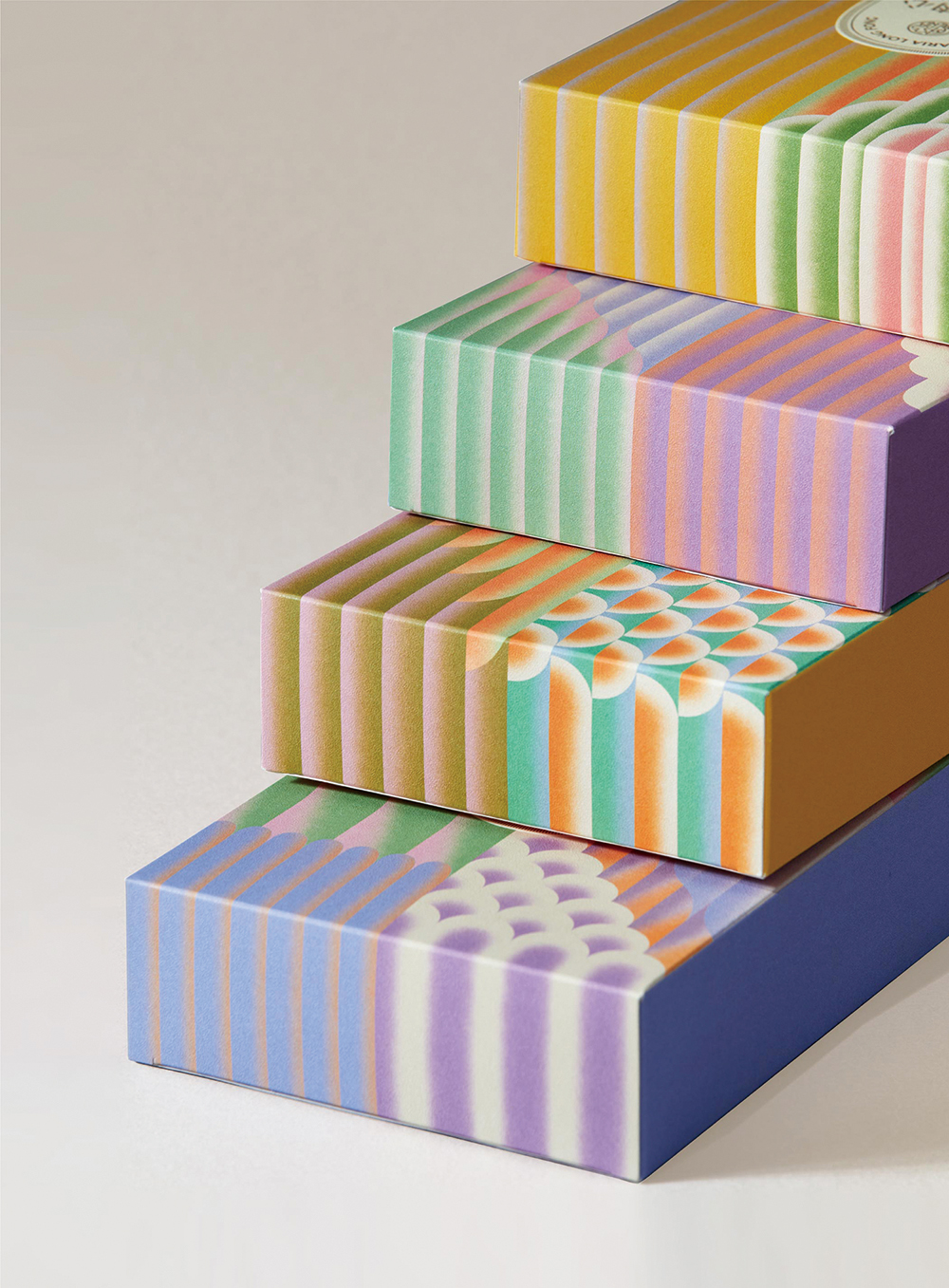
The brand name “Long Fong,” meaning “Dragon and Phoenix,” carries strong cultural symbolism in Chinese tradition. These mythical creatures were reinterpreted through illustrated motifs that became the centerpiece of the packaging design.
The brand name “Long Fong,” meaning “Dragon and Phoenix,” carries strong cultural symbolism in Chinese tradition. These mythical creatures were reinterpreted through illustrated motifs that became the centerpiece of the packaging design.
本專案為澳門 Mercearia Long Fong 龍鳳餅家 的品牌重塑計畫,由 WWAVE DESIGN 規劃整體識別與包裝設計,我受邀參與其中,負責繪製包裝的主視覺圖像。
品牌名稱「龍鳳」寓意吉祥,在華人文化中具有重要象徵,因此我們以圖像語言詮釋龍與鳳的意象,成為包裝設計中的核心視覺元素。
品牌名稱「龍鳳」寓意吉祥,在華人文化中具有重要象徵,因此我們以圖像語言詮釋龍與鳳的意象,成為包裝設計中的核心視覺元素。
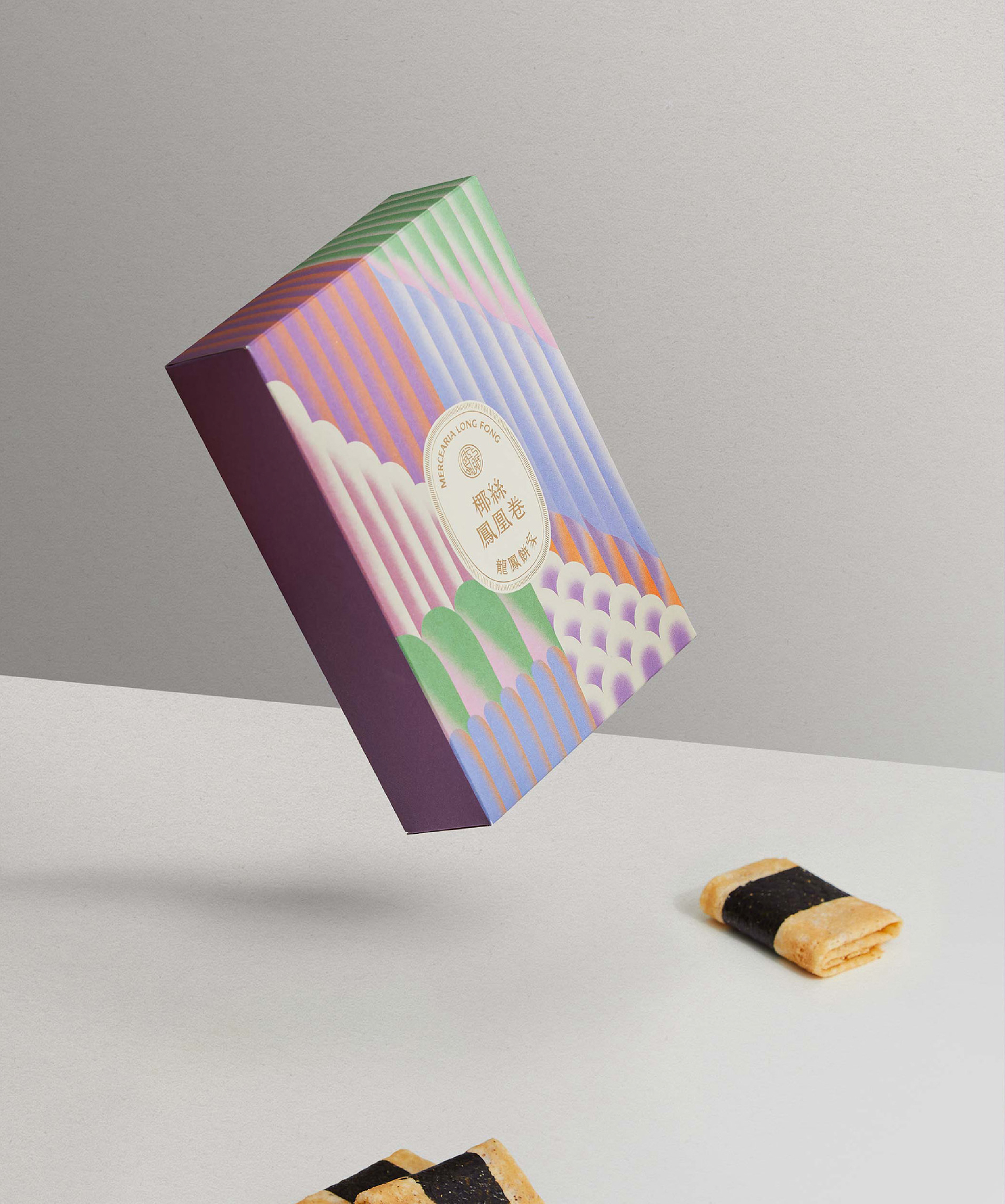
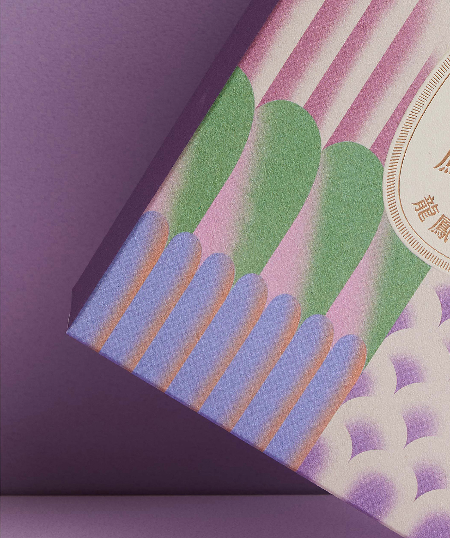

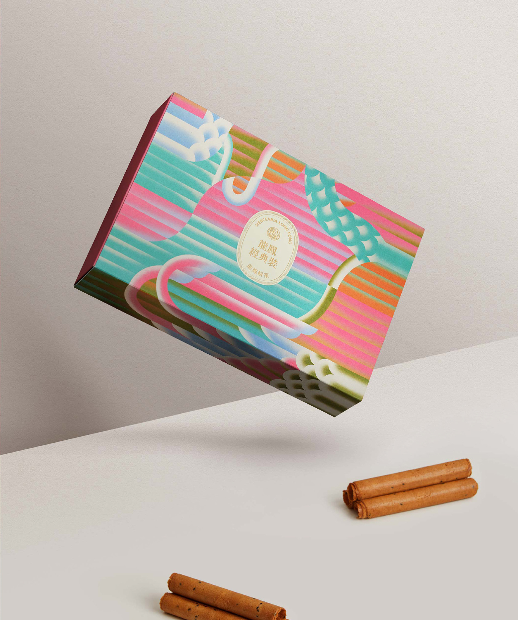
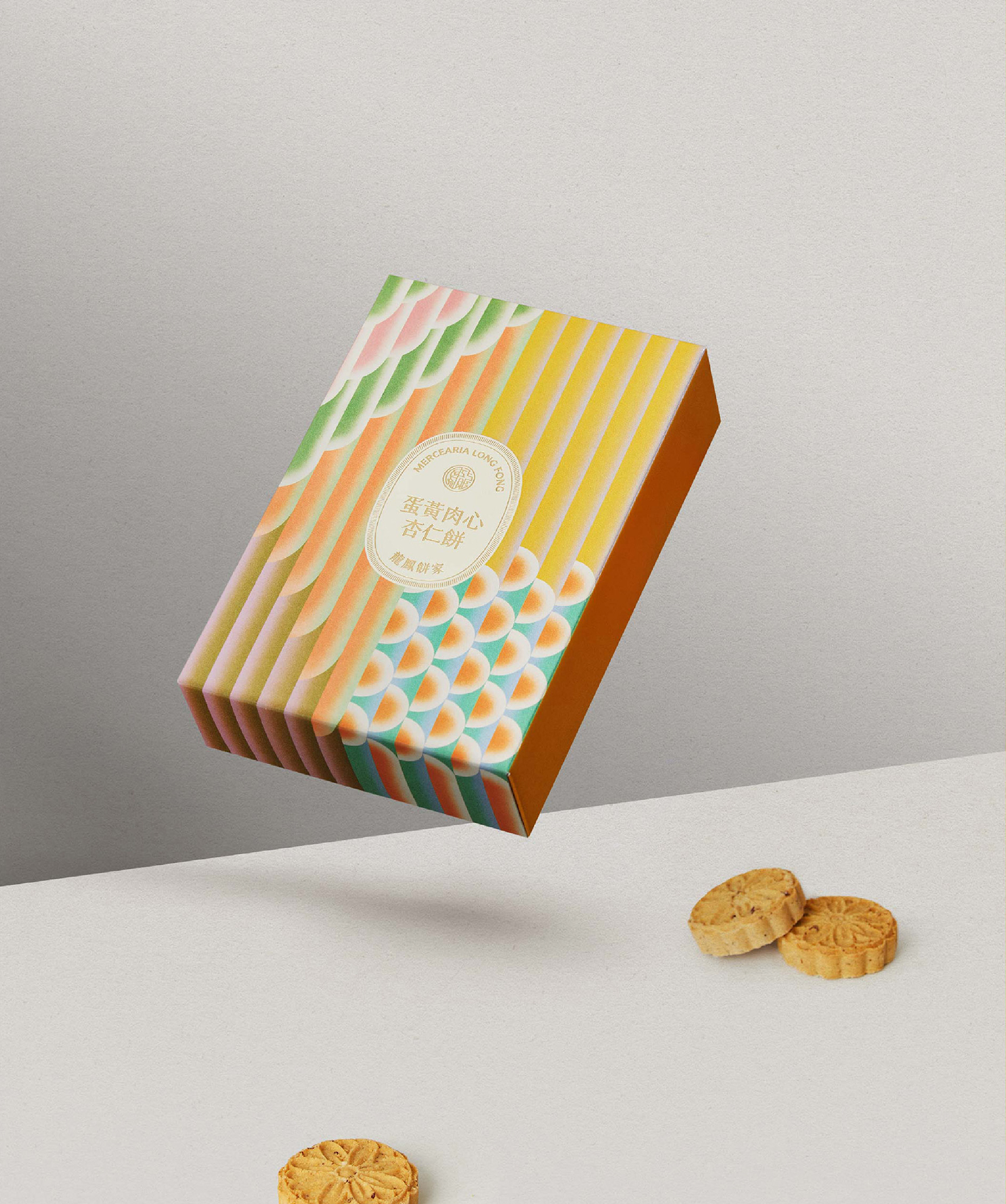
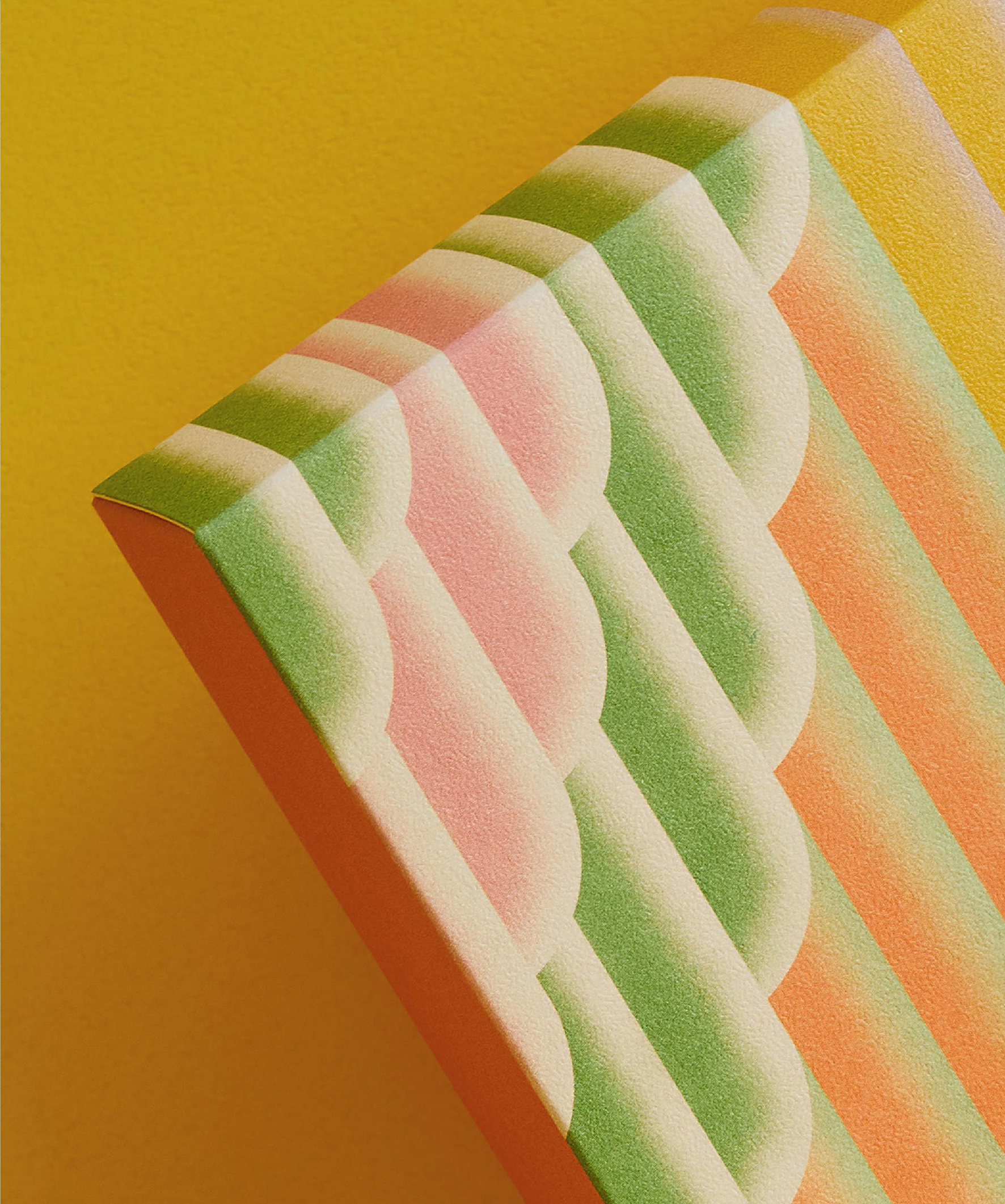
To reflect the diversity of the product line and highlight Macao’s rich cultural heritage, the design incorporates color palettes inspired by the ornate costumes of Cantonese Opera. Combined with the dragon and phoenix imagery, these palettes formed a distinctive visual language that brings out the celebratory and iconic nature of the gift boxes.
為呼應龍鳳多樣的產品線,並呈現澳門豐富的文化脈絡,設計選用靈感來自粵劇服飾的色彩組合。色彩與紋樣交織出獨特的視覺語言,使禮盒在節慶氛圍中更加鮮明而富有辨識度。


©2026 I Chyi Chang. all rights reserved.