
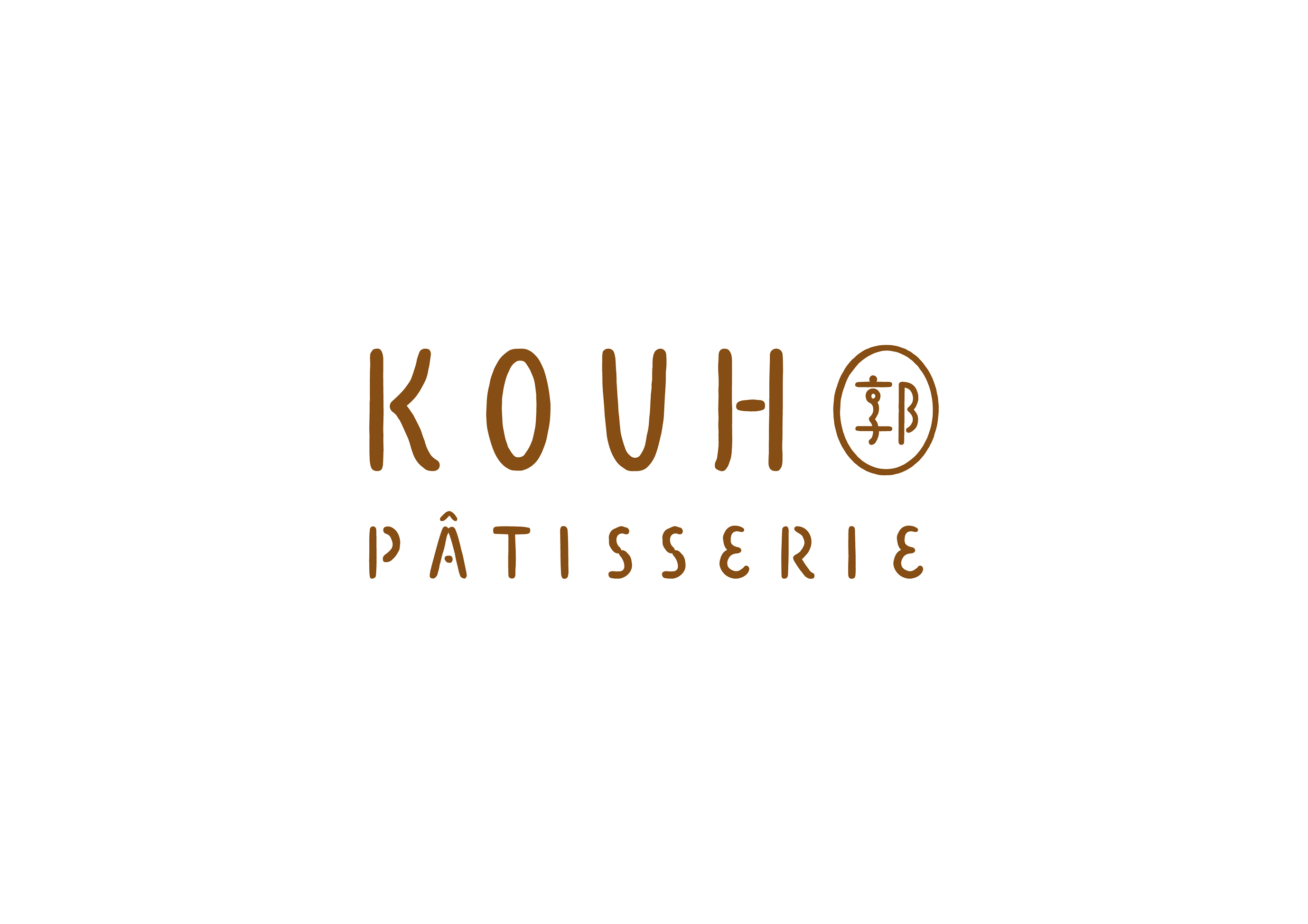
KOUH Pâtisserie- Branding Design
郭甜點 - 品牌識別設計
Client|KOUH 郭甜點
Branding Design
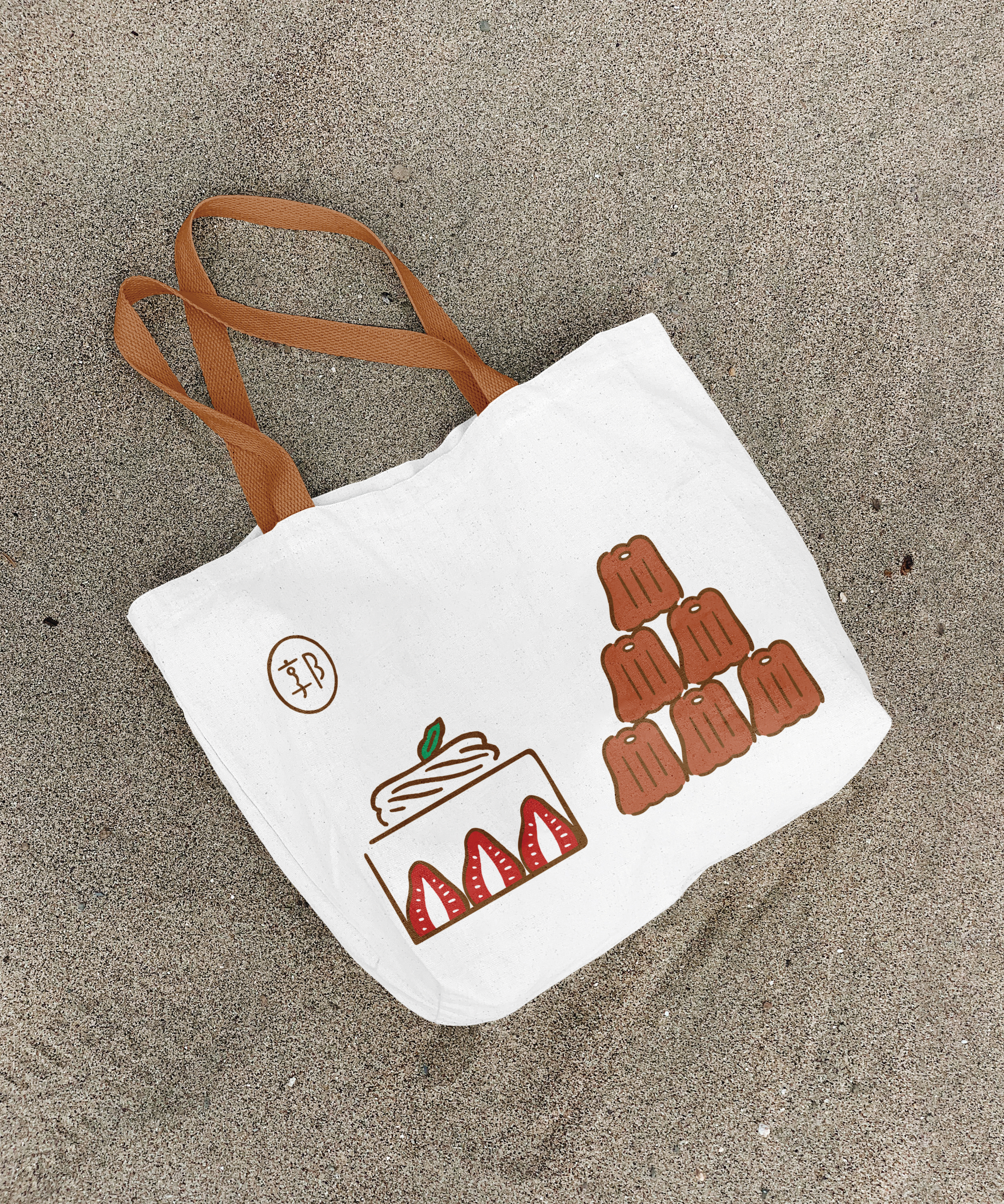
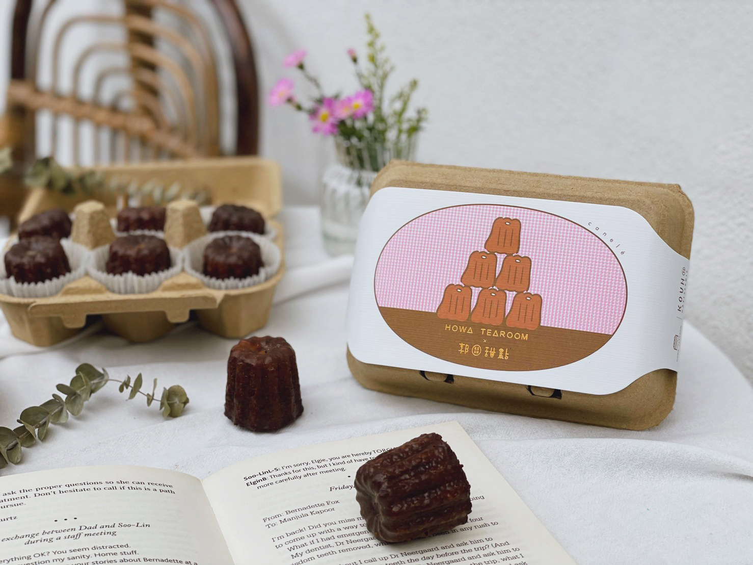
Packaging Design
Illustration
2021
This is the brand identity and packaging design created for KOUH Pâtisserie, an independent dessert studio. The visual direction reflects the founder’s personal character and philosophy — an honest, ingredient-focused approach to pastry making.
為獨立甜點工作室 郭甜點 KOUH Pâtisserie 所設計的品牌識別與包裝設計。視覺風格延續創辦人本人的特質與理念,傳達她對甜點的真誠態度與對食材的講究選擇。
為獨立甜點工作室 郭甜點 KOUH Pâtisserie 所設計的品牌識別與包裝設計。視覺風格延續創辦人本人的特質與理念,傳達她對甜點的真誠態度與對食材的講究選擇。


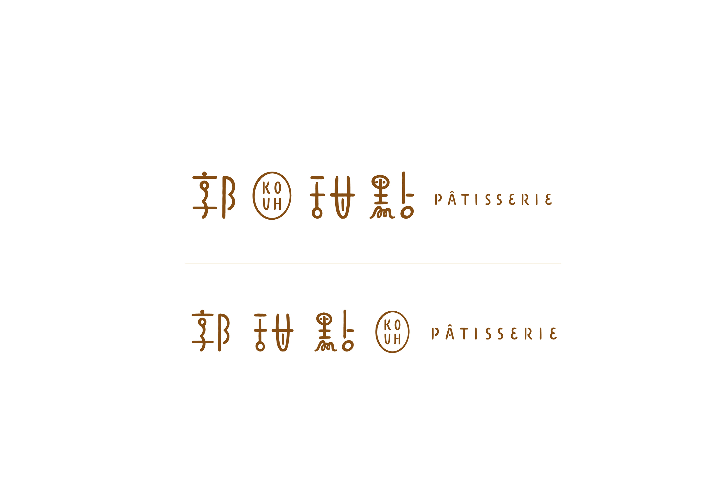
Rooted in simplicity and authenticity, the design features understated tones and tactile materials to convey a quiet confidence and warmth. The logotype centers on the Chinese character “郭” (Kouh) — not only the brand name but also the founder’s surname — creating a personal and meaningful signature.
The brand mark embraces minimalism, allowing the desserts to take the spotlight and the packaging to quietly reflect the spirit of the brand.
整體設計以「質樸」與「真材實料」為核心,採用低調自然的色彩與手感細膩的材質,呈現品牌內斂、可靠又富有溫度的氣質。
標準字設計特別選用品牌名「郭」作為視覺主體,不僅呼應品牌名稱,也致敬創辦人本人的姓氏,為品牌注入專屬的個人印記。識別圖像則以純粹簡潔為出發,讓甜點本身成為主角,使包裝成為理念的延伸。


©2025 I Chyi Chang. all rights reserved.