金香 GIN XIANG|
Golden Flavor of the East
品牌提案/包裝設計
Client|Self-Project
Art Direction
Illustration
Packaging Desgin
2025
Art Direction
Illustration
Packaging Desgin
2025

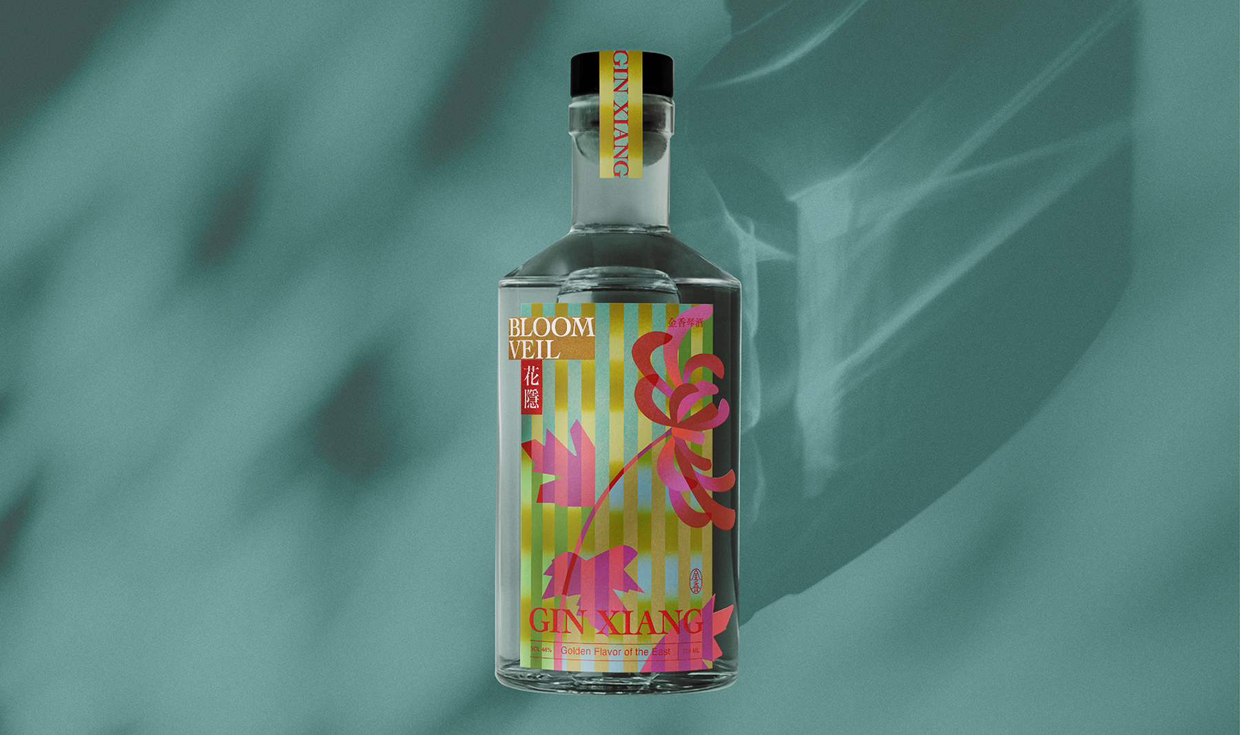
Gin Xiang is a conceptual gin brand proposal that merges modern Chinese aesthetics with contemporary expression.
The name Gin Xiang plays on the sound of “Gin”, while also meaning Golden Fragrance in Chinese—suggesting both the preciousness of flavor and the cultural significance of scent in the East. The inspiration also comes from my personal fondness for the tulip (Yùjīnxiāng in Chinese), making the name a layered metaphor of fragrance, flower, and spirit.
The name Gin Xiang plays on the sound of “Gin”, while also meaning Golden Fragrance in Chinese—suggesting both the preciousness of flavor and the cultural significance of scent in the East. The inspiration also comes from my personal fondness for the tulip (Yùjīnxiāng in Chinese), making the name a layered metaphor of fragrance, flower, and spirit.
「金香 GIN XIANG」是一個以琴酒為題的概念性品牌提案,融合 新中式語彙 與 當代表現手法。
名稱「金香」取其 音似 Gin,同時帶有「東方之香」與「珍貴之味」的意涵。靈感亦來自我喜愛的花卉——鬱金香,讓品牌名稱兼具香氣、花卉與酒的多重象徵。
名稱「金香」取其 音似 Gin,同時帶有「東方之香」與「珍貴之味」的意涵。靈感亦來自我喜愛的花卉——鬱金香,讓品牌名稱兼具香氣、花卉與酒的多重象徵。

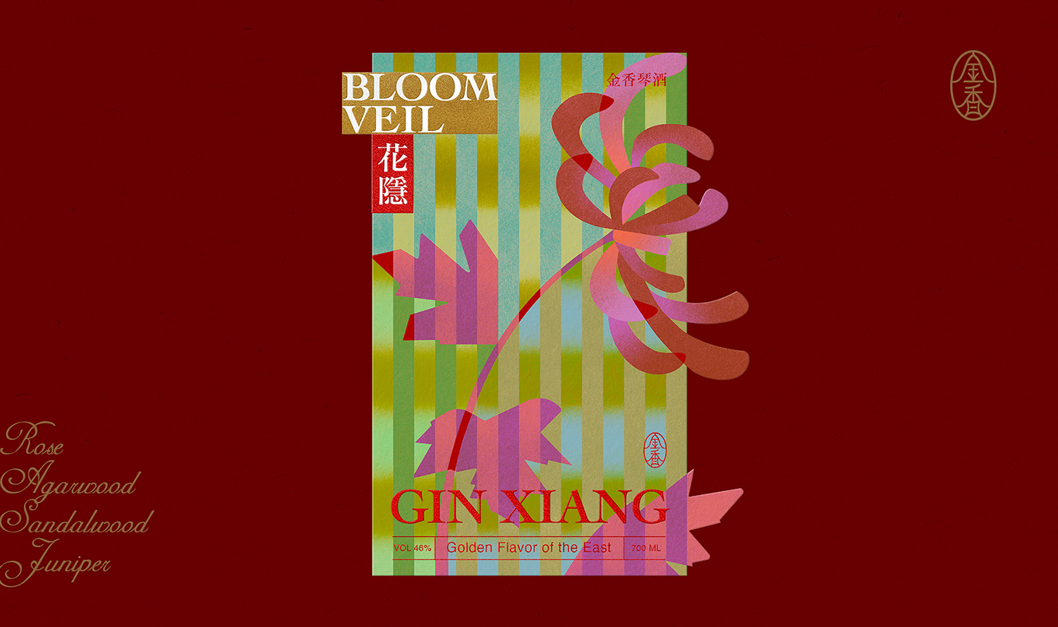
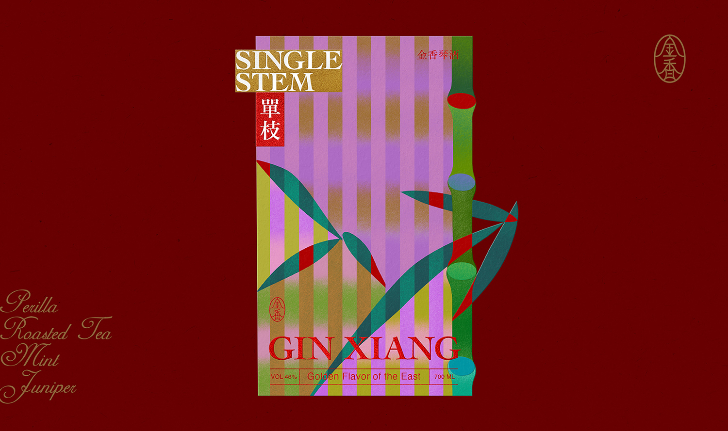
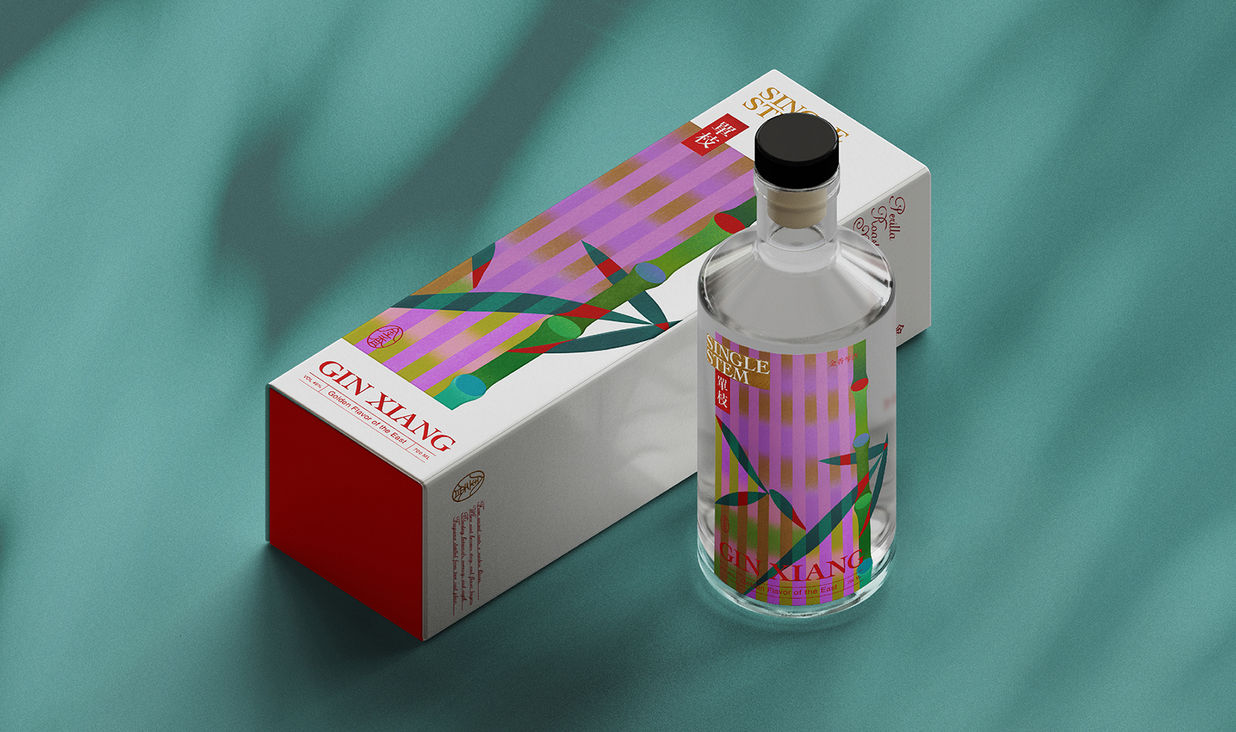
The series introduces two distinct labels:
︎SINGLE STEM: Bamboo shadows embody clarity and resilient herbal tones
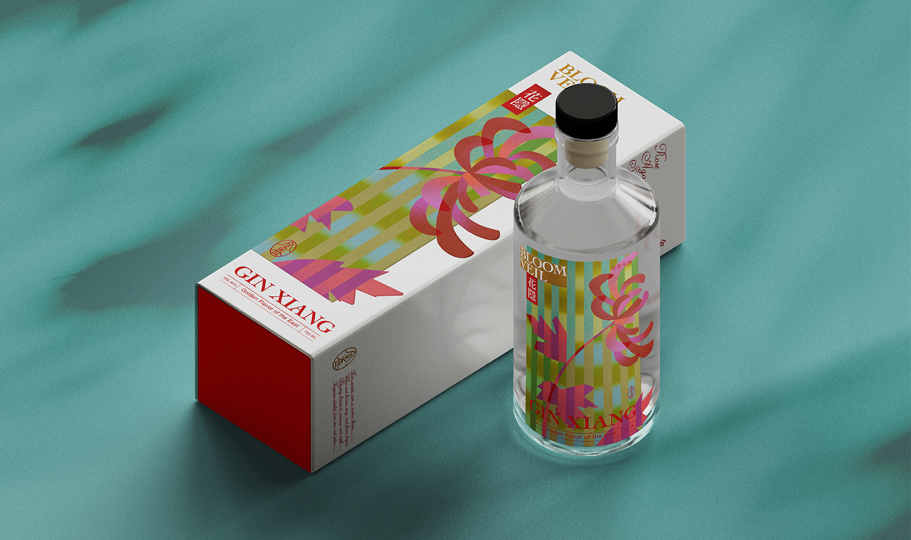
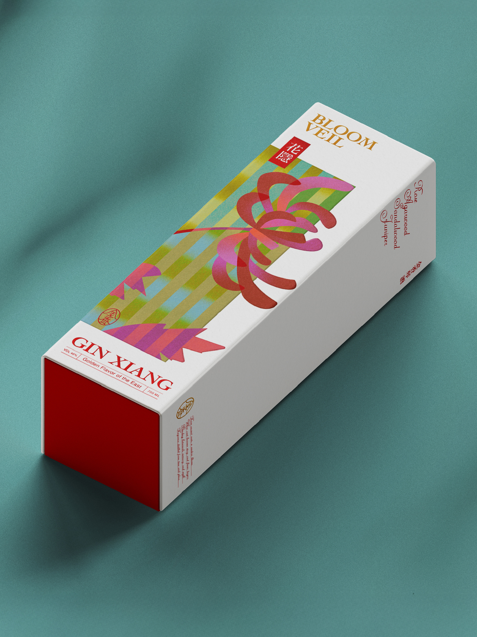
︎BLOOM VEIL: Layered floral silhouettes and interwoven colors evoke the fleeting essence of fragrance
Through illustration and layered colors, the project explores a visual language that bridges Eastern symbolism with the refined world of Western spirits.
系列延伸出兩款酒標設計:
︎單枝 SINGLE STEM:以竹影展現清爽堅韌的草本調
︎花隱 BLOOM VEIL:以層疊花影與色彩交織,描繪若即若離的花香幻影
設計透過插畫與層疊色彩語法,嘗試在東方意象與西方烈酒語境之間,建立一種兼容並蓄的美學。

The Chinese typeface in this project was provided by justfont × Rixing Song 2, as part of the justfont Creator Trial Program.
本專案中文字體由 justfont × 日星宋貳 提供,並參與 justfont 創作者試用計畫。
本專案中文字體由 justfont × 日星宋貳 提供,並參與 justfont 創作者試用計畫。
©2025 I Chyi Chang. all rights reserved.